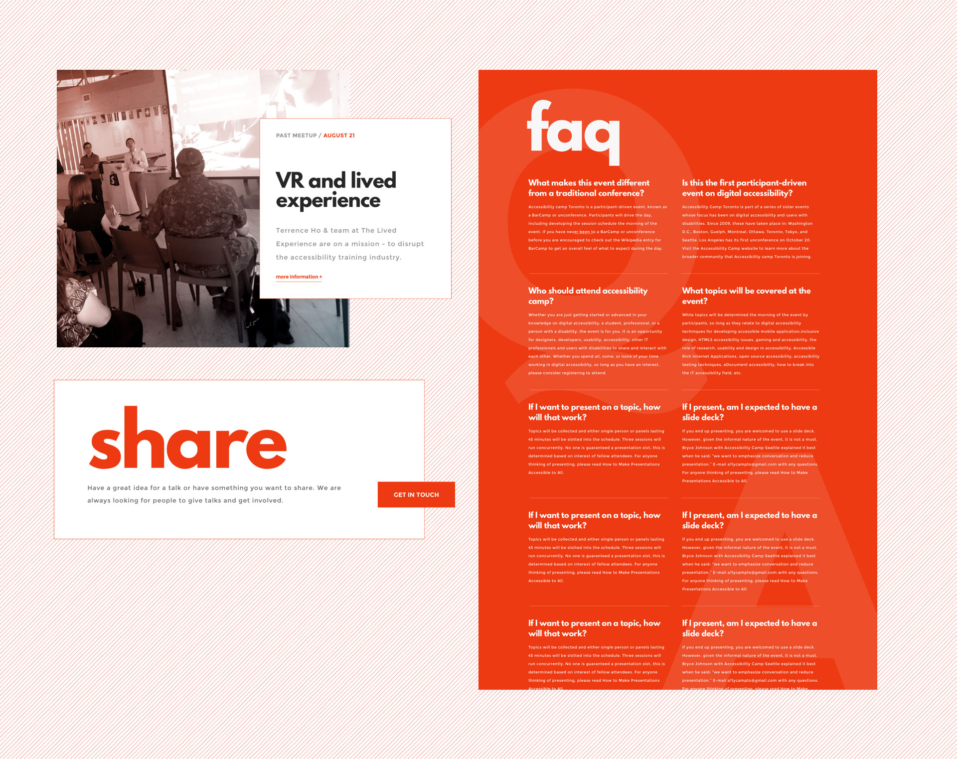
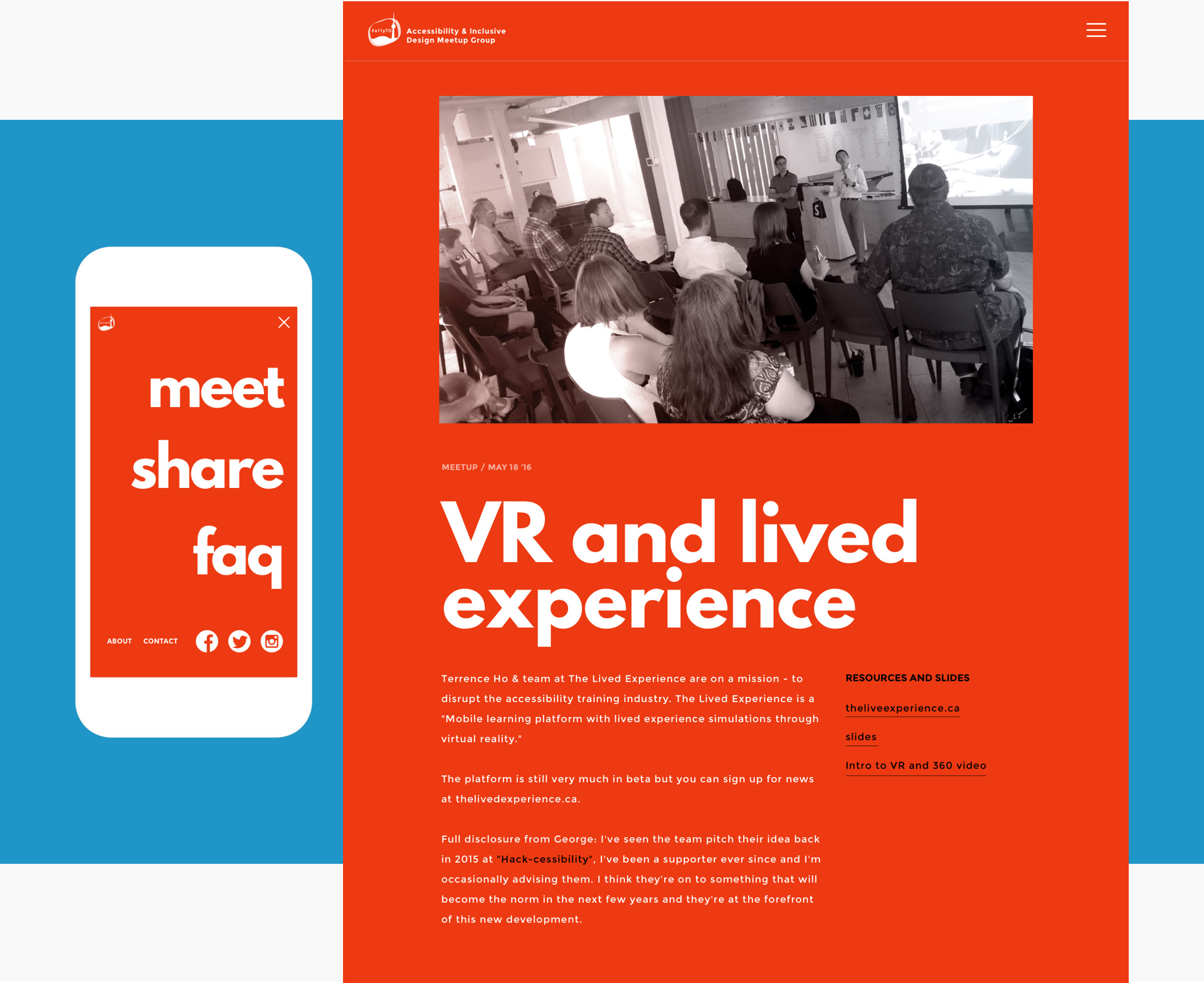
The accessibility toronto meetup group (#A11YTO), one of Toronto’s most active communities, wanted a new digital presence. The group hosts on going monthly meetups for people to learn about digital accessibility, as well as hosting the largest accessibility camp in North America. The website needed to function in these 2 very unique modes.
a11yto
Making accessibility beautiful.
Designers often feel that designing for accessibility means at best being severely limited and at worst having to make some that is ugly. When in fact designing for accessibility means that everyone can find pleasure, beauty and enjoyment from something you have made.
Two for one.
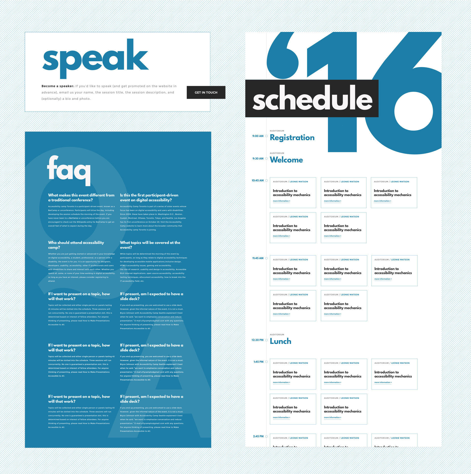
The needs of #a11yTO and its audience differed greatly between regular mode and camp mode. I choose to make these two modes explicit by using two different colors to communicate these 2 modes; red was used for regular meetup mode, and blue was used during camp mode. Along with this, I designing specific elements for each of the modes including a clear easy to use schedule for camp.
“#a11yTO group: a bunch of smart, cool people who care.
–Overhead at Accesibility Camp


